
We are starting another new project for a favorite long term client in Charleston, SC! Oh, the joy!
In October, we flew down to see the new project and make our notes and get inspired (we did a little Christmas decorating while we were at it like magic elves). It was a delightful start to a new project.
How do you start from scratch? New house, new colors, new approach...NEW! It's a little overwhelming to find a beginning point. Inspiration. Style. Color pallet. Where to start?!
This will be the 4th home we've done for a very personal favorite client. She's a joy to work with, listens (and likes!) is agreeable and will take a leap of faith. Pretty much the perfect client! Each home has been different in style and this one is looking like it might just be the most fun yet!
You have heard me say that "textiles are my drug of choice". Well, tonight, Jackie and I stayed late and put together our inspiration. The table (all 12 feet!) was completely covered with "inspiration"...

When the rest of the store gets quiet and the main staff has gone home, that is when the real magic begins! Just take a look;

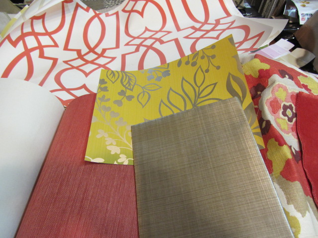
We got out our notes from several weeks ago and recalled that we really wanted to incorporate coral (hot new color trend!) into our new pallet. This cheerful and hip fabric was our first inspiration. My followers know how much I adore chartreuse, so this fabric had instant appeal. When sales reps call on my design studio, we order loads of fabulous memos of textiles that strike our fancy, never knowing when we may have a need for them...I'm sure glad I had this one sent!
After finding the inspiration fabric, we added the coral velveteen (accent pillows), cream linen (sofas) and pulled out a book with this chartreuse quilted velvet. Maybe the perfect thing for an ottoman/coffee table!

I thumbed through a few other favorite sources and opened to this Ikat/medallion print for possible drapery panels. My heart sings!

With all the hip wall coverings that are making a reappearance, we added this to our possible selections. Oh. My. Yes! The chartreuse and grey metallic is pretty cool as well....maybe a powder room close by? Or, maybe not. Yet to be seen. (Of course, we don't even know if our client will be on the same page, but how could she not??!!)
Just in case, we found a metallic taupe stria paper and a fabulous coral string paper! I thought you might like to see the larger picture of the coral graphic one too!

Pure joy, style and color!

Then the question...what kind of drapery would be the perfect balance to this bold color? It took a while to search through our drapery weight fabrics, and I came up with this. It's a beautiful sheer linen tone on tone cream awning stripe...very subtle and a perfect match to the background of the coral graphic wall paper.

So, this is a shot of the inspiration as it was building. (Pay no attention to the paint strips in the background...they are just "markers" we use from a paint deck that fell apart!) I did, however, find a paint can in the back stockroom that looked like a perfect match for...who knows what, yet?! It was an old Duron can, "Poinsettia". I peeled off a heavy drip, took it to the table, and wow! Perfect match. It's pretty bold, so I'm not sure what we will use it on...an old table, sideboard, piano? Just sayin'.

And this is just a sneak peek at the family room pallet. Graphite with a pop of coral to tie it all together!
I'll keep you posted as to our progress once we show our client!
We left a bit tired from a long day, but exhilarated and in pure style.
Pure. Style.
2 comments:
Love. Especially the last photo.
Love the floral, Ikat, and quilted chartreuse velvet! So fresh and happy!
Post a Comment